User experience is the overall perception and feeling that users get after interacting with a digital product. The experience that users get when interacting with e-commerce sites is very crucial since it determines whether browsing a site will end up as conversion in sales.
The aim of this article is to provide basic user experience rules that an online business should implement. The user experience is established from the moment the user opens the site to the final product that is purchased.
№ 1: Speed
Your online business should invest in how fast a web page loads. According to a great study on website loading time by the folks of KissMetrics only a 1 second delay in page response can result in a 7% reduction in conversions. To put this into perspective:
If an e-commerce site is making $100,000 per day, a 1 second page delay could potentially cost you $2.5 million in lost sales every year.
In today’s age, everyone is rushing to complete tasks, to take up new ones, and as such, speed is of the essence. When a website is slow, it contributes to abandonment since impatient users will leave the site in frustration.
№ 2: Simplicity
When it comes to business websites, keeping everything simple is crucial. Why? Because simple websites convert better.
Optimizing a page – specifically simplifying information’s journey from eye to brain – is about communicating as much as you can in as few elements as possible. Neil Patel on ConversionXXL
Incorporating standard graphics like shopping baskets and trolleys on standard places (top right) is ideal since the user does not have to navigate the entire page to search for a cart. Whichever design the business chooses to employ, it should follow prototypical e-commerce layouts and be simple for users to comprehend.
№ 3: Usability
An excellent online experience should be pleasurable and enjoyable rather than frustrating. The site should be usable for the users to accomplish their goals quickly. How to check your site for usability? Observer real people trying to check out on your site for the very first time. This method is called remote usability testing and is the easiest and most efficient way to check if your eCommerce site is actually usable. Check out our DIY how to guide or learn which things you should test on a regular basis.
Satisfaction is the ultimate norm, and therefore the user should be able to use the site to achieve the intended objective. The digital space should also be flexible, such that users can move backward and forward without losing any information unintentionally.
№ 4: Consistency
When designing an online platform for business, consistency in graphical elements, texts, and images to avoid confusion and mix-ups is crucial. One concept in a page should mean the same in another page or screen to ease the shopping experience of the user.
Follow digital design standards and use design systems to make sure that you can offer a coherent and consistent experience for your online shoppers.
№ 5: User Freedom
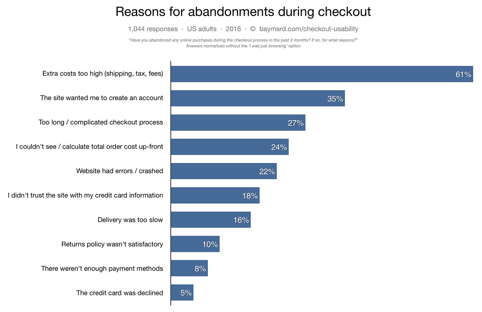
Online checkouts should be pain-free rather than a forced process. According to a study 35% of users will abandon their shopping cart if they have to create a new user account. Creating accounts should therefore not be prerequisite to be allowed to purchase goods, as consumers are looking forward to a quick and pleasant experience when shopping.
Provide a guest checkout on your site and allow your customers to navigate and even checkout on the site without creating accounts, and. When you don’t have the possibility to provide a guest checkout, offer incentives when accounts are created.
№ 6: Defensive Design
No matter how carefully you design the user experience of your site and how much you test and improve your usability, things will go wrong. Designing for upfront errors makes sure, that you can deliver a great user experience even when things go wrong.
In case of errors, they should be explained in simple language so that nothing gets lost in translation. Consumers appreciate solutions rather than problems. You can learn more about how to design for errors in 37signals’ excellent book Defensive Design for the Web.
№ 7: Help and documentation
Online businesses should have a website that directs the consumers to a ‘help’ option when they find it impossible to accomplish various tasks. The option should be visible and should contain a list of Frequently Asked Questions (FAQ) which direct the consumer on the necessary steps to take to solve their issue.
Used strategically, FAQ pages can alleviate purchasing anxieties that your product page copy doesn’t directly address.
and relieving some of the burden on customer support by publicly answering common questions.
Summing up
This article expounds on some of the rules that online businesses should incorporate in their digital platforms to enhance the user experience. Integrating the above techniques gives the company an edge over the competitors since consumers who are satisfied by a service are likely to be loyal, hence augmenting the return on investments.
Paul Bates has over 7 years experience creating engaging and usable online experiences. He is now consulting SolidEssay, ConfidentWriters, Beestudent.com and other online educational platforms on user interface design and usability testing.