According to a user eye-tracking study conducted by the Missouri University of Science and Technology, it only takes a fraction of a second for users to formulate an opinion about a website. This same study revealed that it subsequently takes users about 2.6 seconds for their eyes to land on the most influential part of a website – the company logo.
What are the key areas for first impressions?
Key areas, determined by the number of time users eyes are focused on a particular area, include:
- The company logo: 6.5 seconds
- The main navigation 6.44 seconds
- The search box: 6 seconds
- Social sharing links: 5.95 seconds
- The main or central image: 5.94 seconds
- The written content: 5.59 seconds
Measuring first impression with eye-tracking
Study participants looked at screenshots only, so their first impressions were based exclusively on design and didn’t include other elements such as page load speed or video.
Visual components such as color, text legibility and the compelling use of images (particularly, the main image on the page) all played a part in whether users had a favorable or unfavorable response to a given website.
Let’s take a deeper dive into each of the above items.
Logo
While it may take your visitors less than one second to get a first impression of your website, it can take 5-7 views before a user recognizes your logo. Thus, your company’s logo should be easily recognizable and use colors that are unique, but also pleasing. A unique color can increase brand recognition by up to 80% (e.g., UPS brown, John Deere Green).
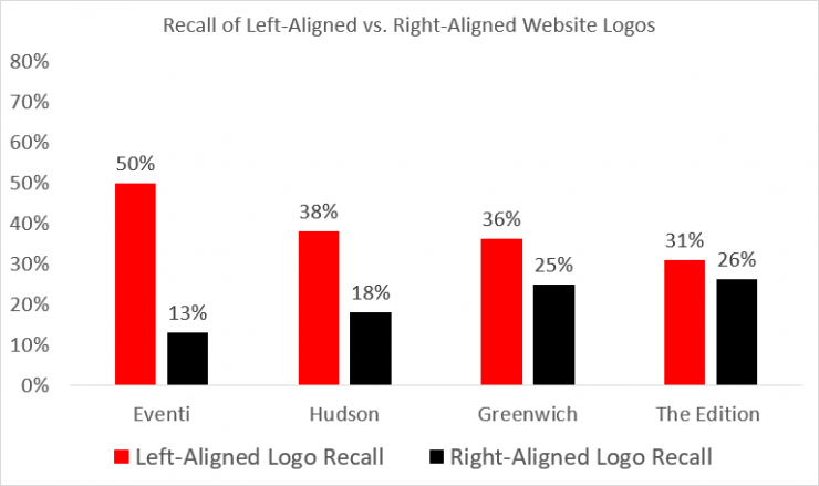
Since our brains process images much faster than words, consider including an image as part of (or alongside) your company logo. Finally, place the logo at the top left of the page – this has become the expected position for website logos and users are 89% more likely to remember logos shown in the traditional top-left position than logos placed on the right, like this study by Nielsen Norman showed:
Main Navigation
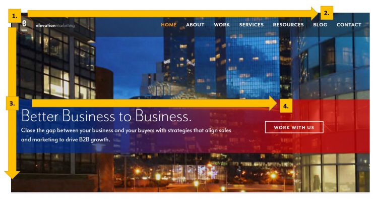
In 2006, Jakob Nielsen’s eye-tracking studies revealed that users tend to browse the web in an “F” pattern, starting from the top left of the page and scanning down, then right. With this in mind, make sure important elements of your website are located across the top of the page and along the left sidebar.
There is an exception to the F Pattern rule in cases where users know what they’re looking for (perhaps they’re further down the buying funnel). They tend to abandon the F pattern of search behavior and hone in on specific visual cues. This is where landing pages come in handy.
Landing pages are developed with a specific goal in mind. They contain a limited amount of text and images and generally have only one action for visitors to complete (e.g., filling out a lead form, watching a video, etc).
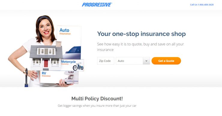
Below is an example of Progressive’s landing page for the term “liability insurance.” This page has a central design with all page elements guiding the eye to the middle of the page and the one action Progressive wants users to take – namely, get a quote:
Social sharing links
The Missouri University study (which was conducted in 2012) revealed that social media links were a key area of interest for users. Fast forward eight years and now it’s difficult to find a website that doesn’t feature some type of social sharing button or icon.
Social sharing links have become an essential way for sites to distribute their content, particularly information-rich websites like blogs and news organizations. But social sharing buttons may be a distraction if your goal is to get people to convert.
Finland-based e-commerce store, Taloon, conducted an A/B split test which involved removing their social sharing buttons from their website product pages. They found that the absence of social sharing icons increased “Add to Cart” button clicks by nearly 12%.
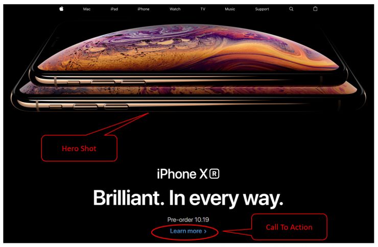
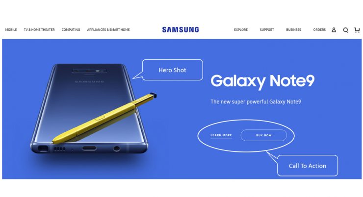
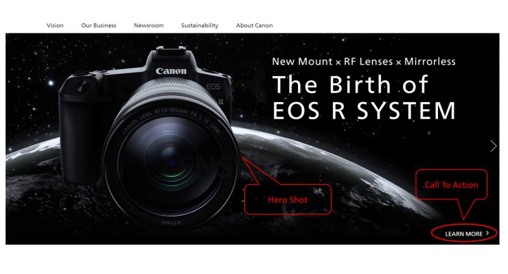
Your Central Image
The main image – or “hero image” – on your website draws the user’s eye and helps establish the first impression of your website’s overall design. This image – which may also be a video – serves many purposes, but ideally, it will tell a story (in an instant) and have strong visual appeal.
Central images must be high quality, professional and fast loading. They are typically placed at the top of the page and are often, but not always, accompanied by a bit of text which draws the user’s attention to a desired goal, feature, or action that you want to highlight.
Here are a few examples of compelling hero images from some top tech sites. Notice how the text on these pages is located directly above or close by the call-to-action (CTA) links (e.g., “Learn more” and “Pre-order”).
The written content
In the Missouri University study, users spent nearly just as much time looking at written content as they did on visual elements like logos and images. Written content is critical for usability as well as search engine rankings.
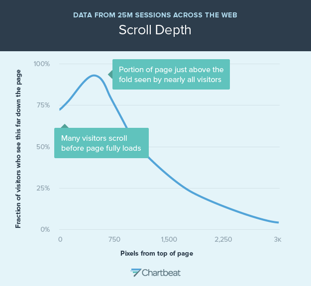
Companies can easily incorporate written content into their website’s design by adopting a long-scrolling layout that puts the main visual elements and CTA buttons at top of the page, while incorporating additional written content beneath these elements in an endless scroll.
This goes against an older practice of placing content “above the fold” – that is, the part of the webpage that a user sees without having to scroll down. A study by Chartbeat revealed that 66% of user attention on a webpage is spent below the fold and showed that people used the scrollbar on 76% of the over 100,000 web pages in the study:
Conclusion
As with everything design related, it’s important to user test your website or landing page to see what works best for your business. A good design will not only help sell your products or services, but it can also get you repeat business, considering 88% of online consumers are less likely to return to your website after a bad experience. There’s real power in first impressions!
An expert search, social and content marketer, Ryan Gould leads Elevation Marketing‘s digital strategy department, helping brands achieve their business goals, such as improving sales and market share, by developing integrated marketing strategies distinguished by research, storytelling, engagement, and conversion. With a proven track record of energizing brands, engaging audiences and managing multi-discipline marketing teams, Ryan is a respected expert in achieving consistent results through creative design, thought-provoking narratives, and innovative problem-solving.
You can find Ryan on LinkedIn and Twitter.